How might we enhance customer engagement and drive market growth for traditional financial institutions in Eastern European markets?
In this project, I contributed to the design and launch of a new mobile banking experience for Raiffeisen Bank International, tailored to Eastern European markets. Over 18 months, our team developed a user-friendly app for both iOS and Android, while establishing a design system and supporting the growth of an in-house design team.
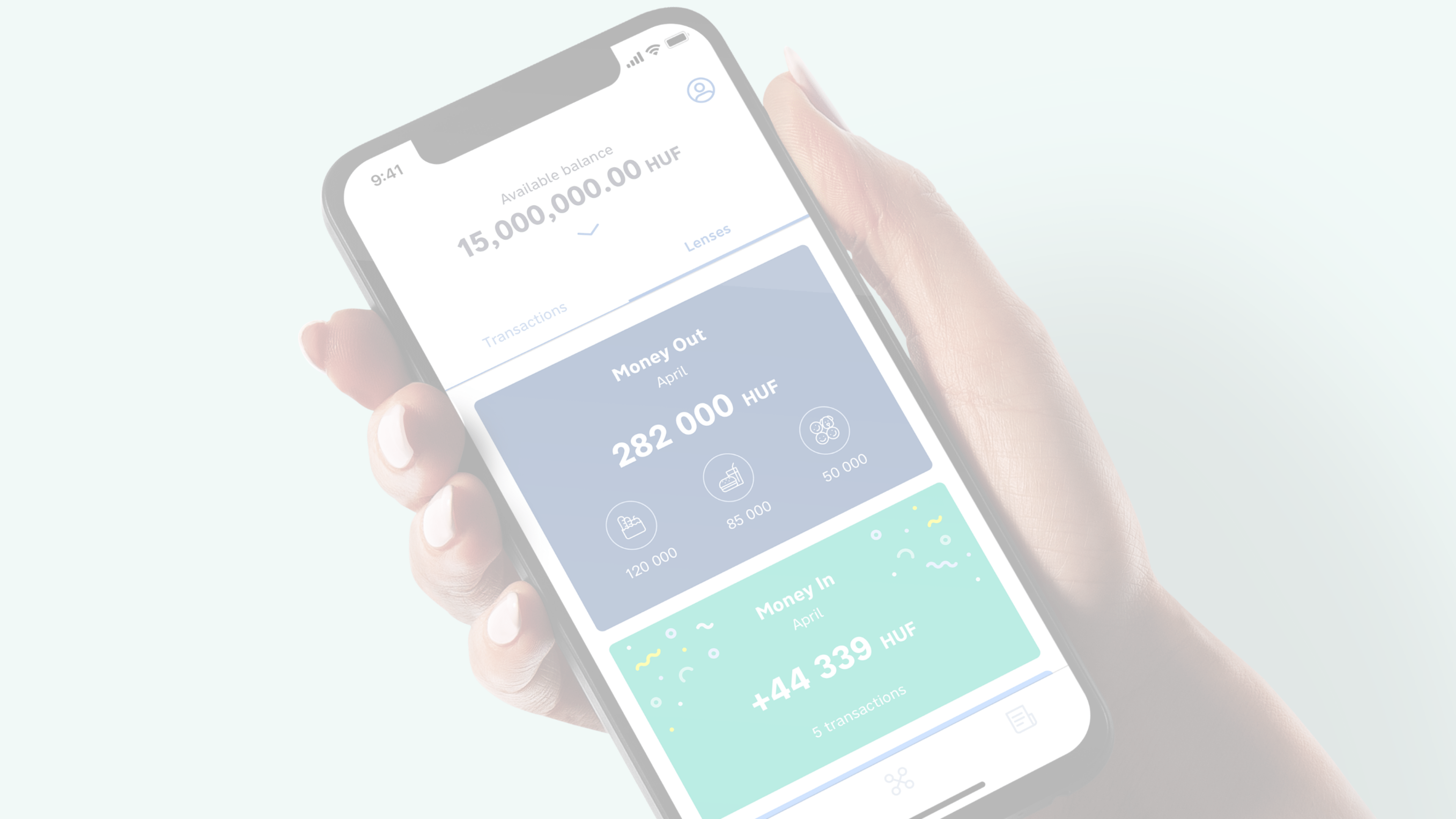
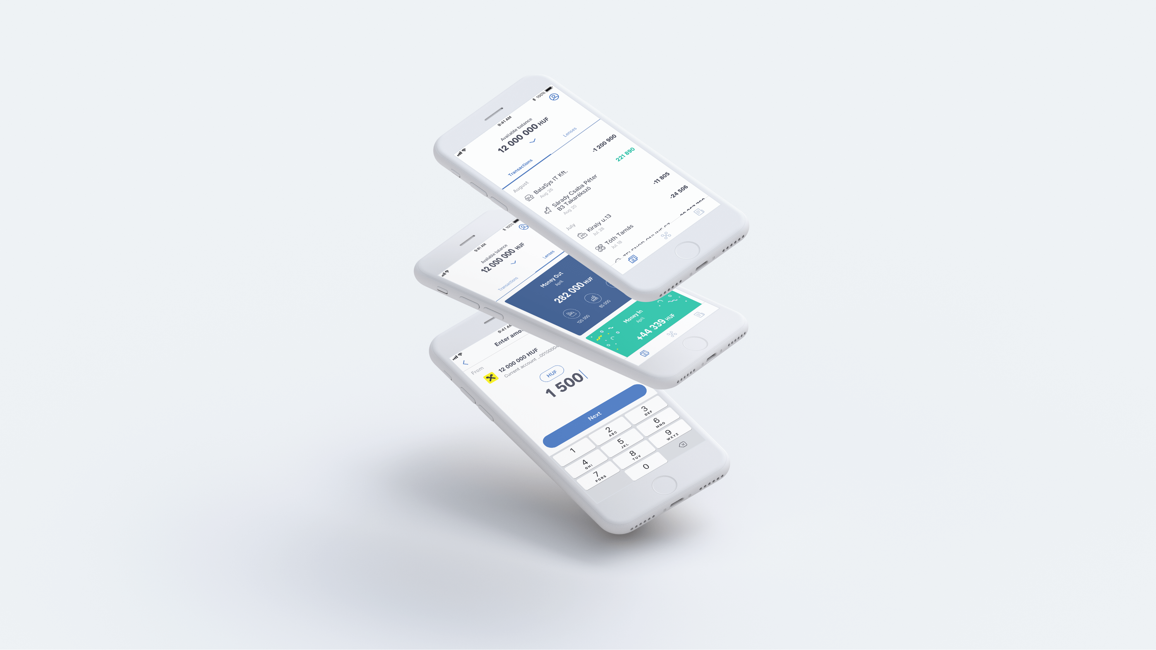
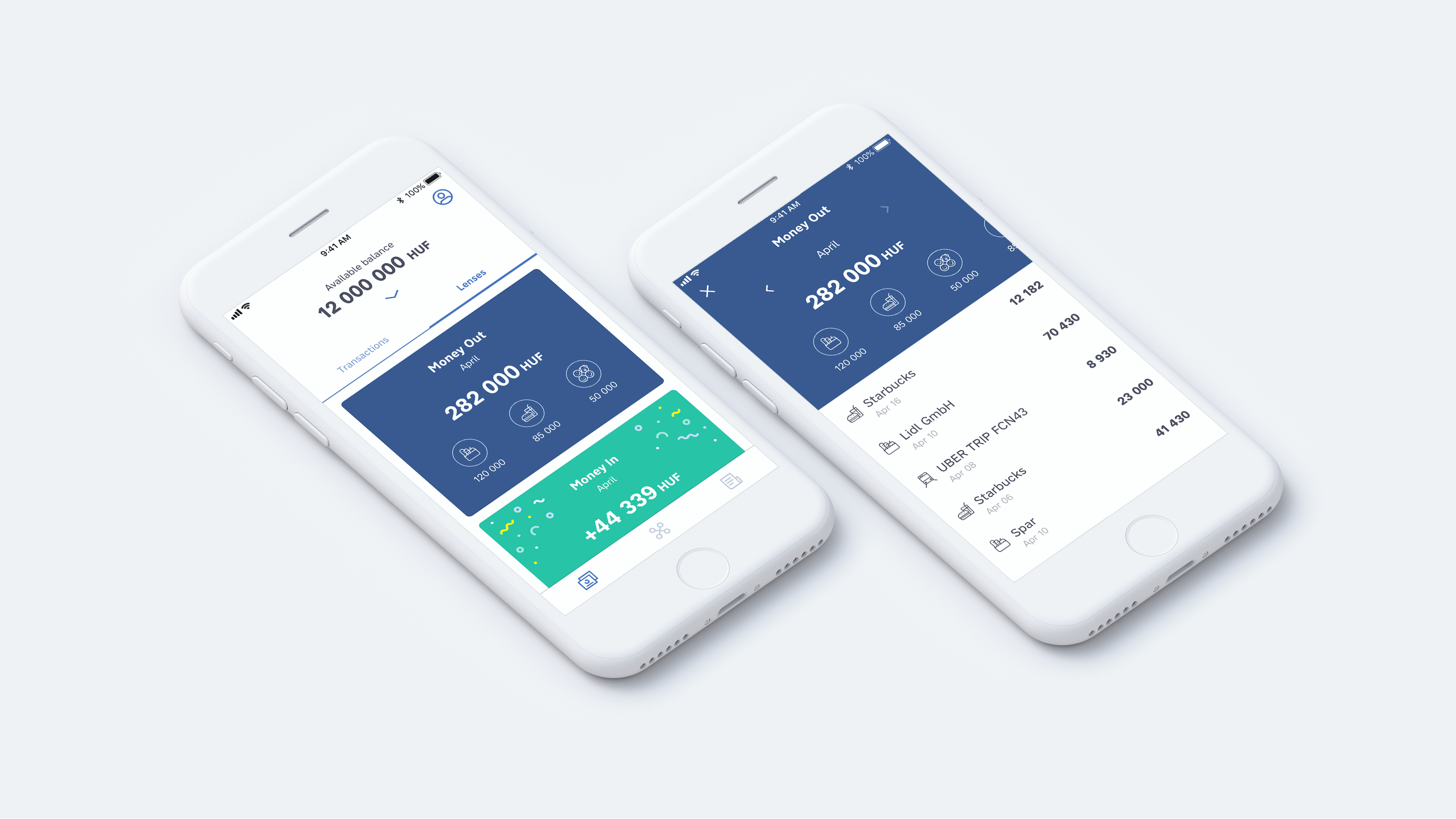
I was responsible for leading a feature team and driving the Android adaptation, ensuring a seamless experience across platforms. By introducing innovative features like Lenses, which allow users to understand their spending in meaningful contexts, we transformed how users engage with their personal finances. The app exceeded business KPIs and achieved top ratings on both app stores.
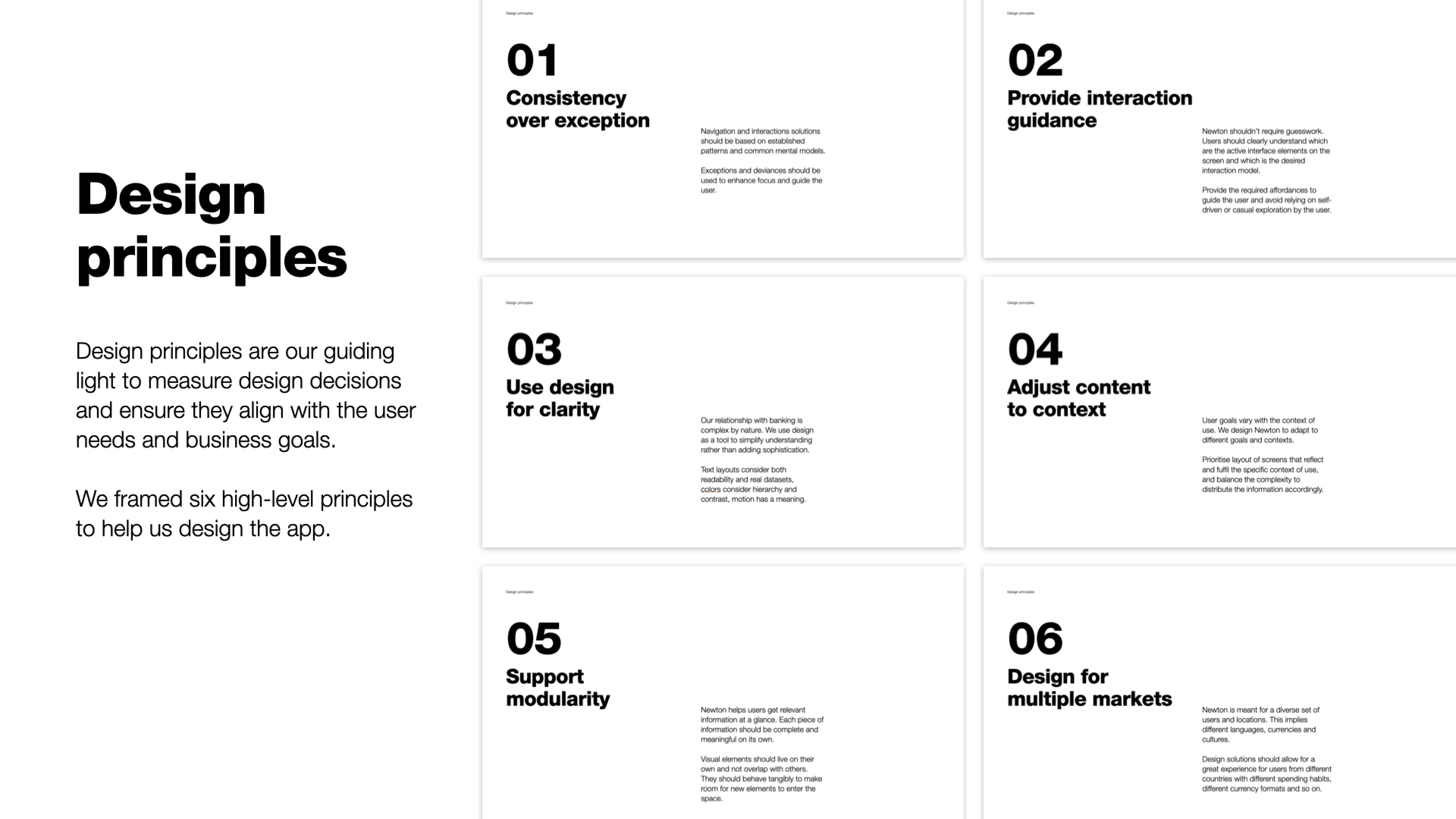
In 2018/2019 we were asked to support one of the largest banks in Central and Eastern Europe, Raiffeisen Bank International (RBI), who wanted to increase customer engagement while growing in the regional mobile banking market. Together, we designed and launched a mobile banking experience, supported the creation of an in-house design team, and built a design system to optimise future projects.
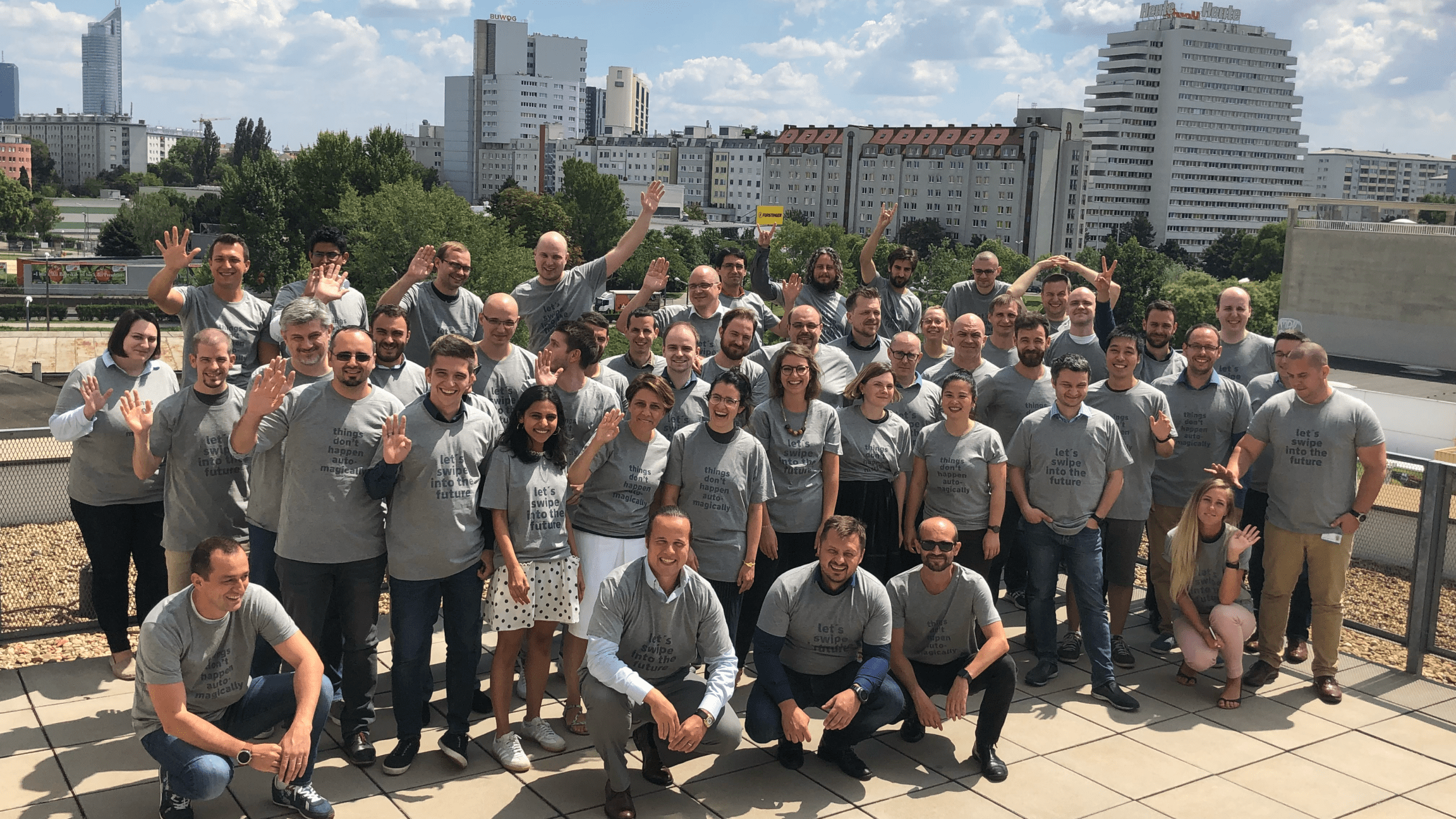
After the team defined the visual brand language and design guidelines for future reference, our team of typically 6 designers conceptualised, designed and worked closely with onsite management and development in an agile process to bring this vision of a simple, smart everyday banking experience to life for both iOS and Android within 18 months.
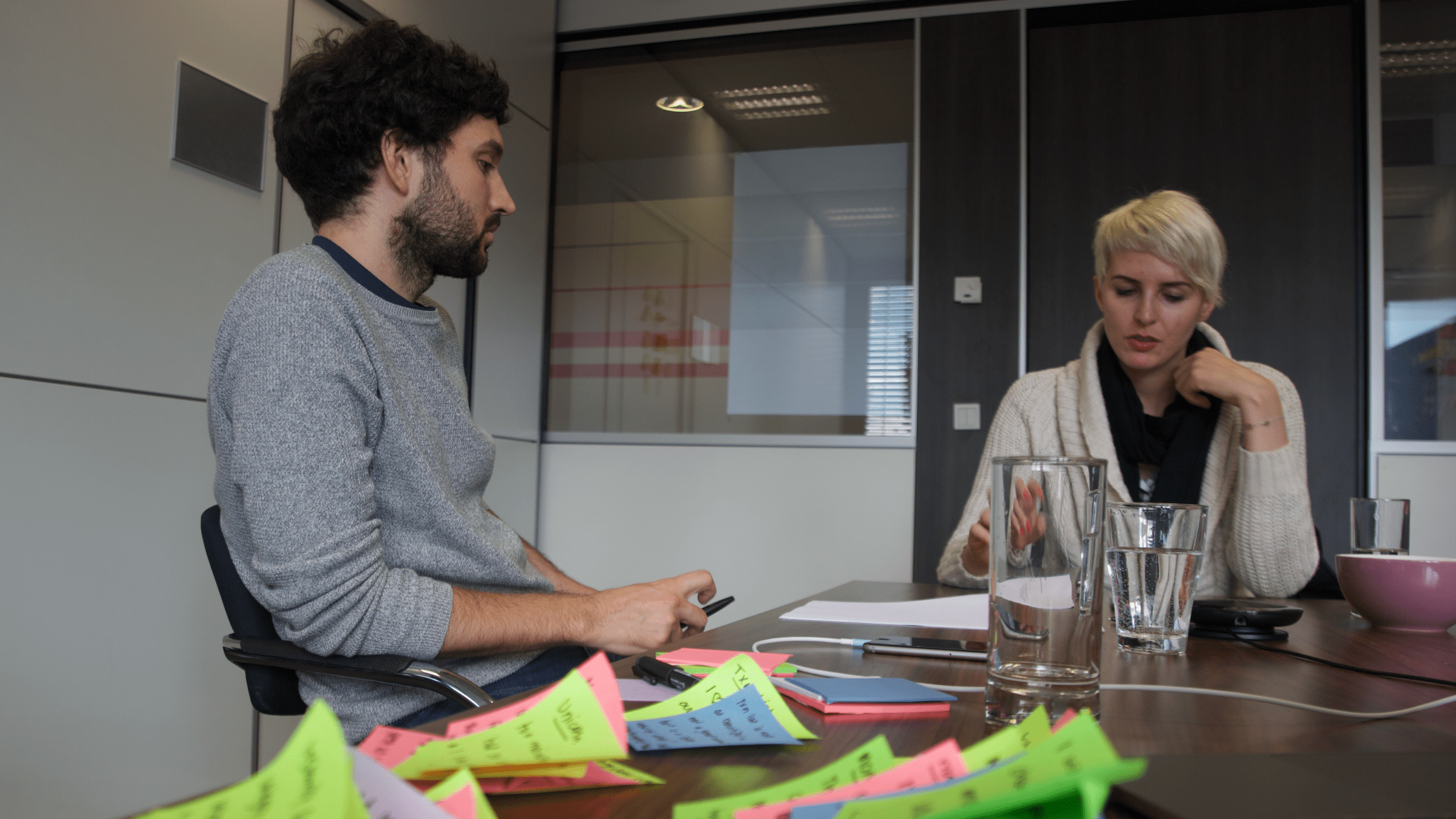
We developed new features while validating design solutions through user research and competitive benchmarking, facilitating workshops and user testing, leading the hiring and onboarding of in-house designers, and supporting marketing with the product launch. In parallel, we built a design system to optimise future production and ensure design consistency for RBI.
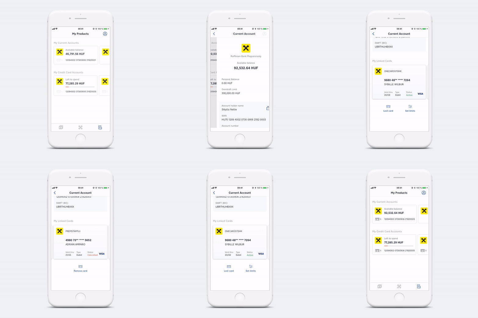
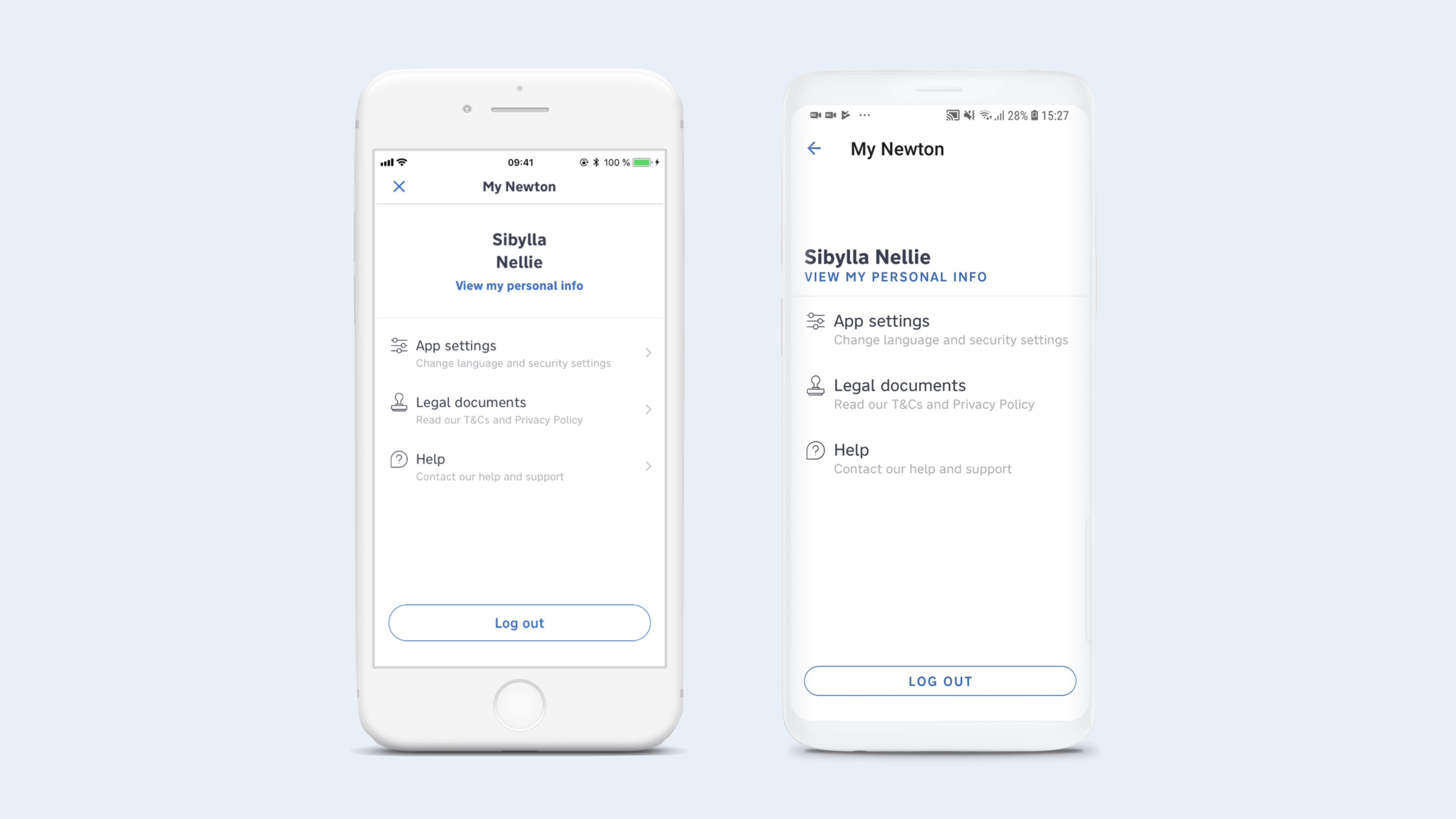
As a product designer in a team of 5, I led one of the three feature teams, which mainly worked on the implementation of the products section, where users can easily manage all their accounts and cards, as well as a number of settings functions (i.e. registration, login/logout, password handling, etc.), while also assisting in the exploration phases of larger topics such as Lenses.
I was also primarily responsible for the Android adaptation of the app. When I joined the project, I noticed that the designs and interactions were quite iOS-heavy. I pointed this out to the team and fought to correct it, as Android had a 75% market share in our target markets in Eastern Europe.
Over time, I took over the setup and maintenance of the design system to ensure a strong foundation for development and future design implementations as our core external design team gradually handed over the design to the newly formed internal team.
We pioneered a fresh perspective on banking by crafting a compelling narrative around personal finance. Graphs, cards and piecharts weren’t convincing us. What is truly meaningful to our users when they need to understand their money better? Traditional banking apps typically categorize spending into generic groups like ‚Restaurants‘ and ‚Supermarkets‘.
However, our research revealed, “Users don’t think in categories, they think in contexts.”
We designed Lenses to give our users different ways of seeing how they spend money and what drives their money flows. Users build their own Lenses by choosing different ways of filtering – based on transaction value, merchant name, locations, payment types and time periods i.e. moments. For instance, the ‚Little Things‘ lens aggregates all expenses below a certain threshold, helping users visualize how much they spend on small, often overlooked purchases.
This contextual approach empowers users to better understand and manage their finances.
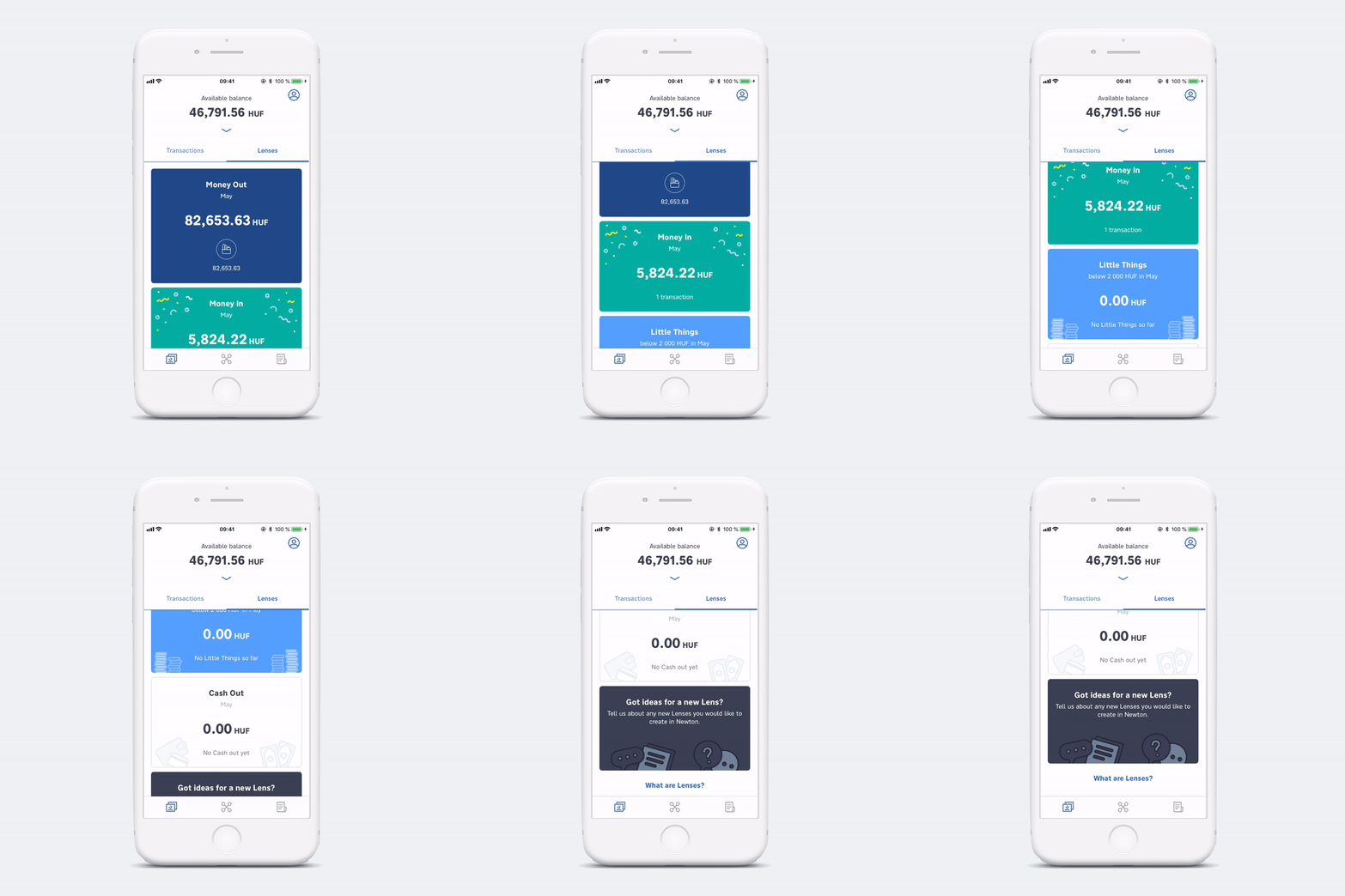
The launch of myRaiffeisen has exceeded business KPIs and expectations. In May 2019, it went live on the App Store and Google Play store in Hungary, with more than 10,000+ users. The average user rating is 4.5 stars on iOS and 4.3 stars on Android. In February 2020, it became the #1 finance app in the Hungarian app store.
- Build Trust and Educate Stakeholders
Foster a trustful relationship between the Product Owner (PO) and the design team. Ensure all key stakeholders understand the comprehensive value and workflow of design, extending beyond just screen aesthetics. - Establish a Solid Design Foundation Early
Invest time at the beginning of the project to develop a strong design foundation with a clear brand and product rationale. This will ensure a cohesive and consistent product outcome. - Plan for Development and Decision-Making Time
Allocate sufficient time and resources for development processes and business decision-making. Don’t underestimate the effort required in these areas. - Integrate Research into the Timeline
Properly schedule research spikes within the project timeline. Avoid running research tasks in parallel with other major activities to ensure thorough and effective research outcomes. - Maintain a Stable and Aligned Team
Keep a stable core team throughout the project to maintain focus. Ensure the team has consistent travel schedules and regular benchmarking and internal design reviews to sustain a productive workflow and high-quality deliverables.
