How might we evolve the visual language of a successful premium product without losing its strong design heritage?
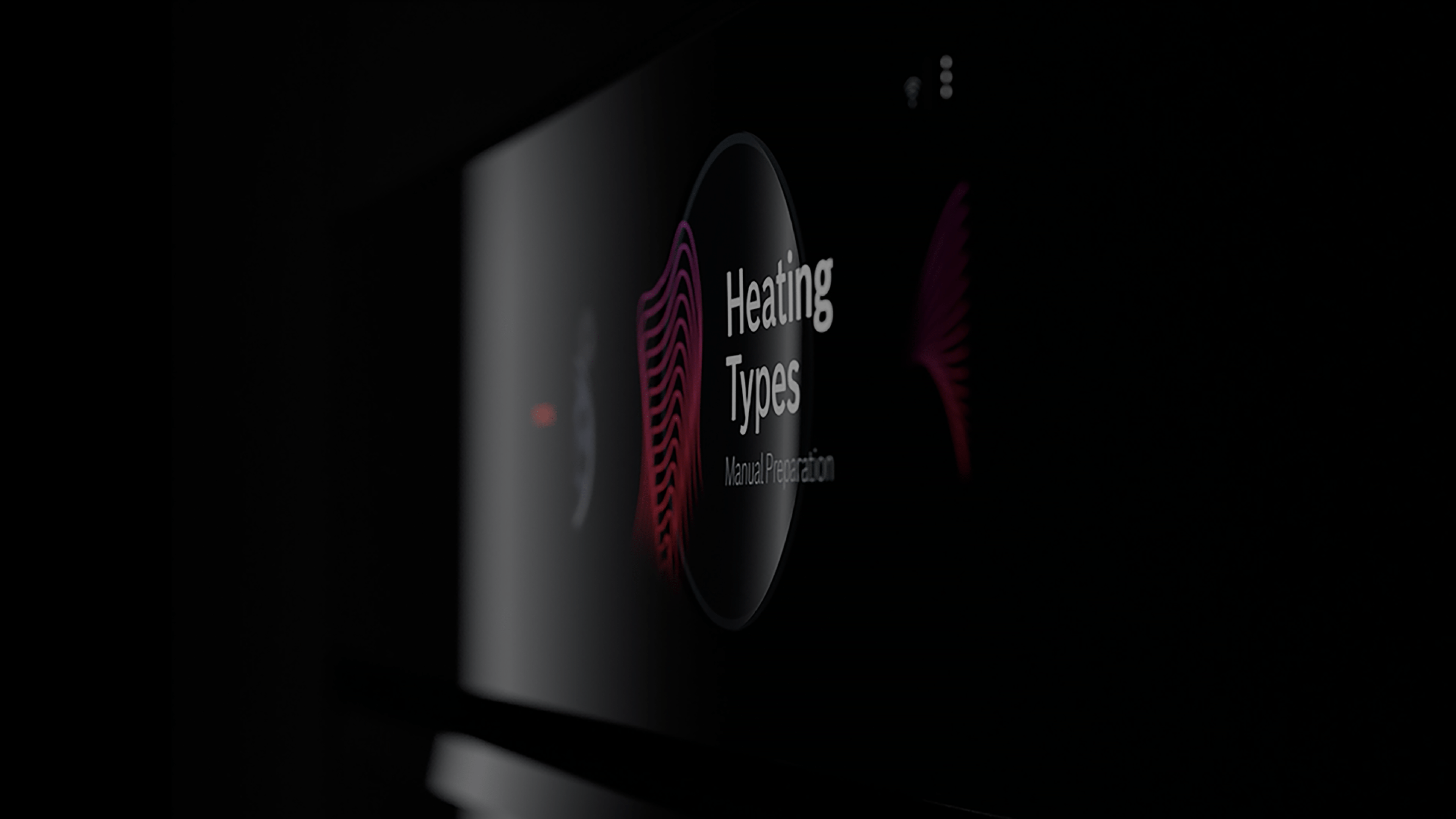
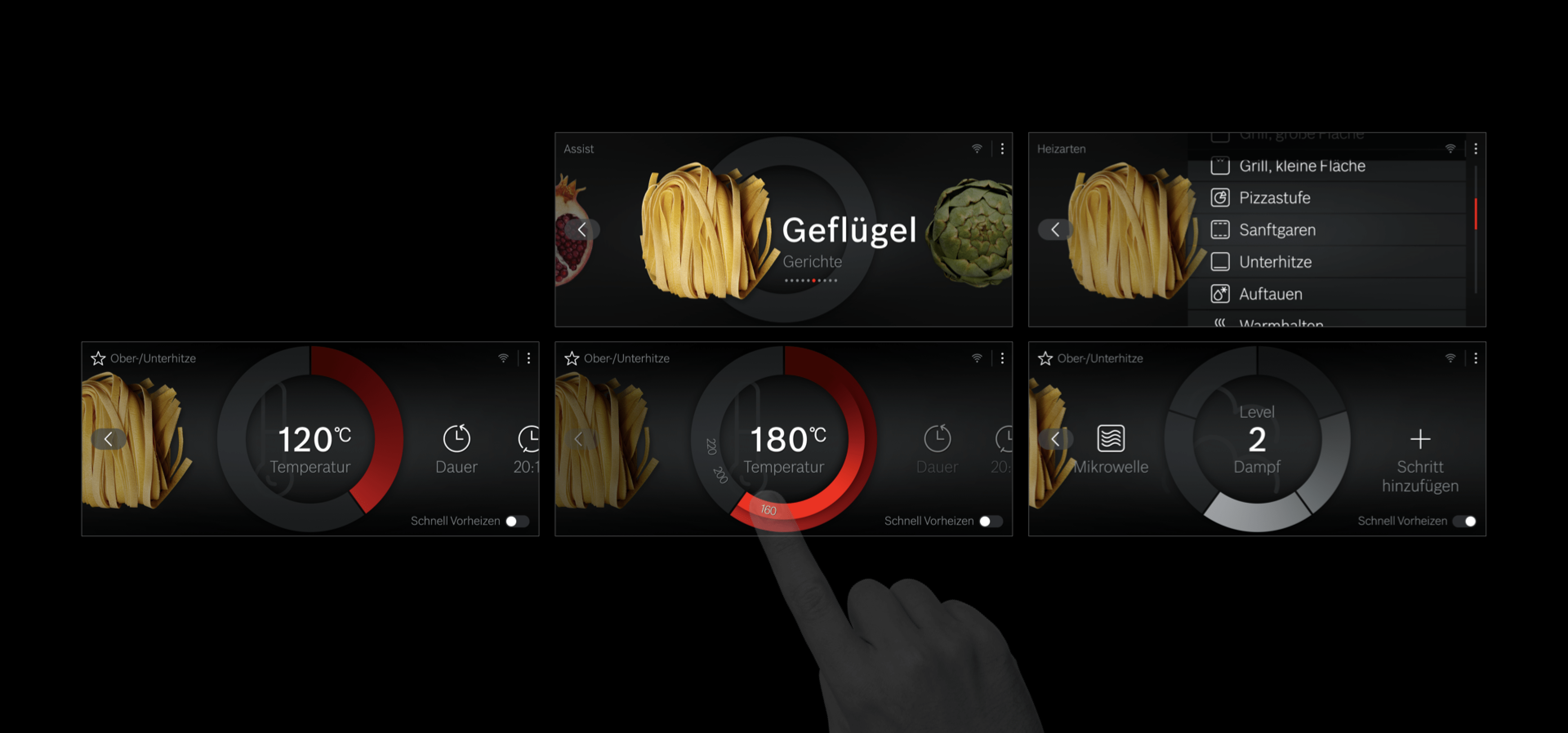
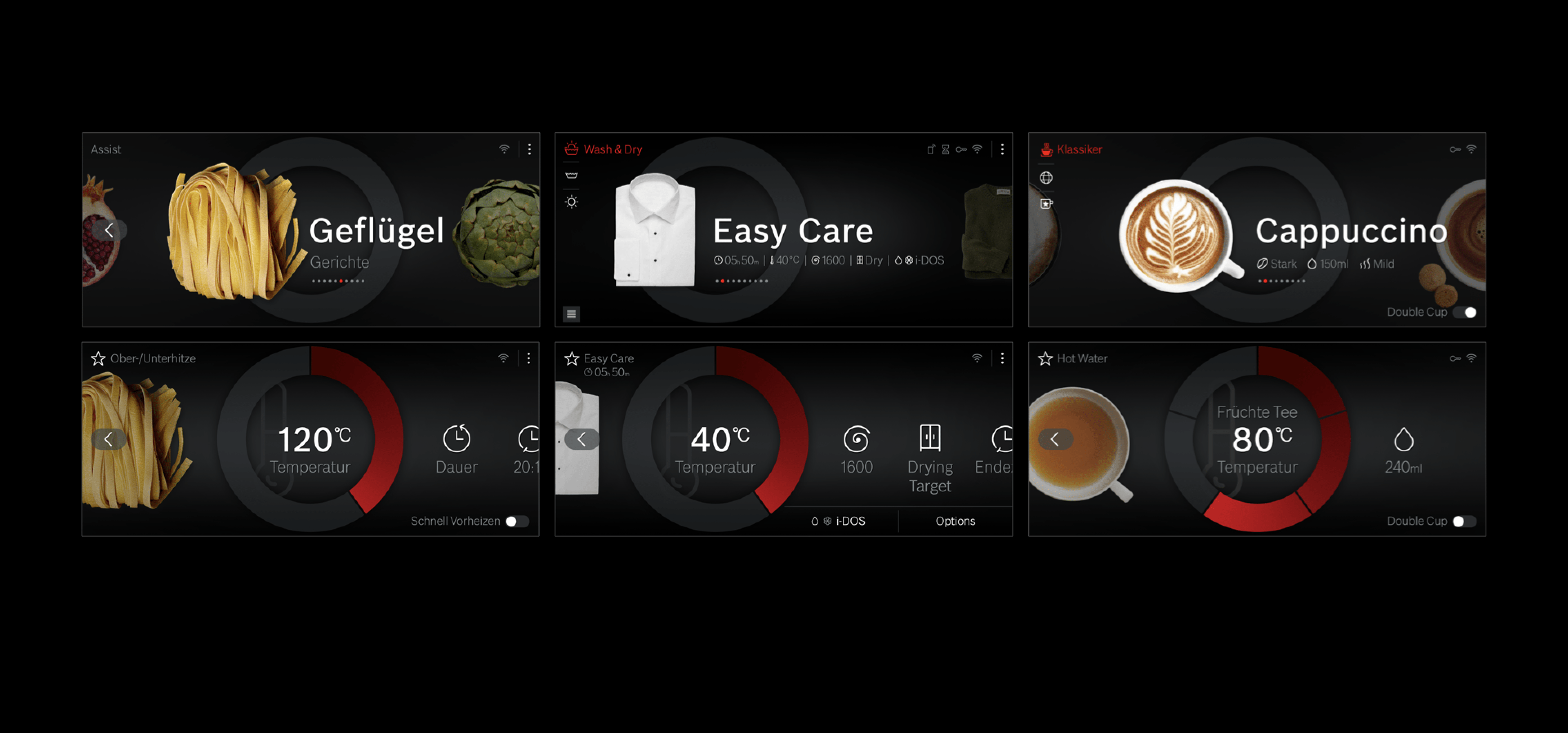
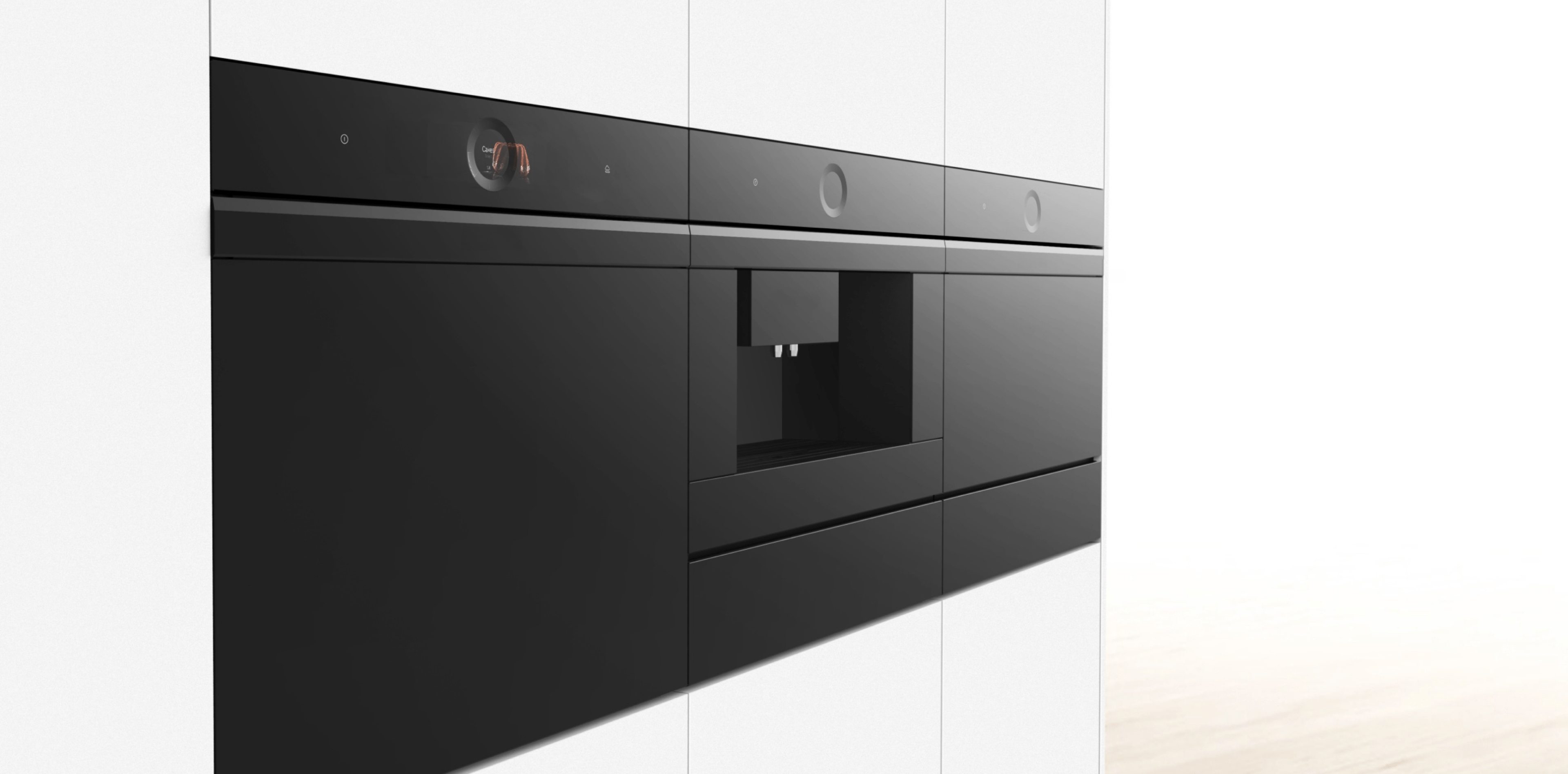
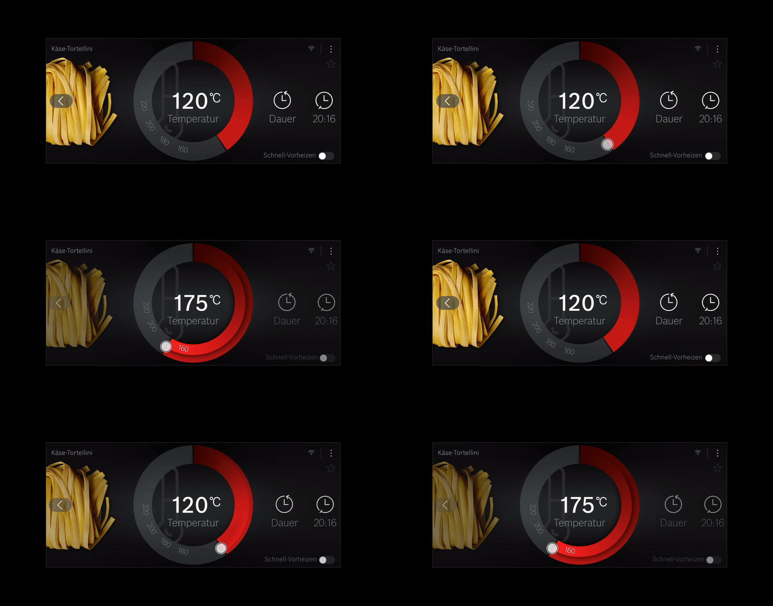
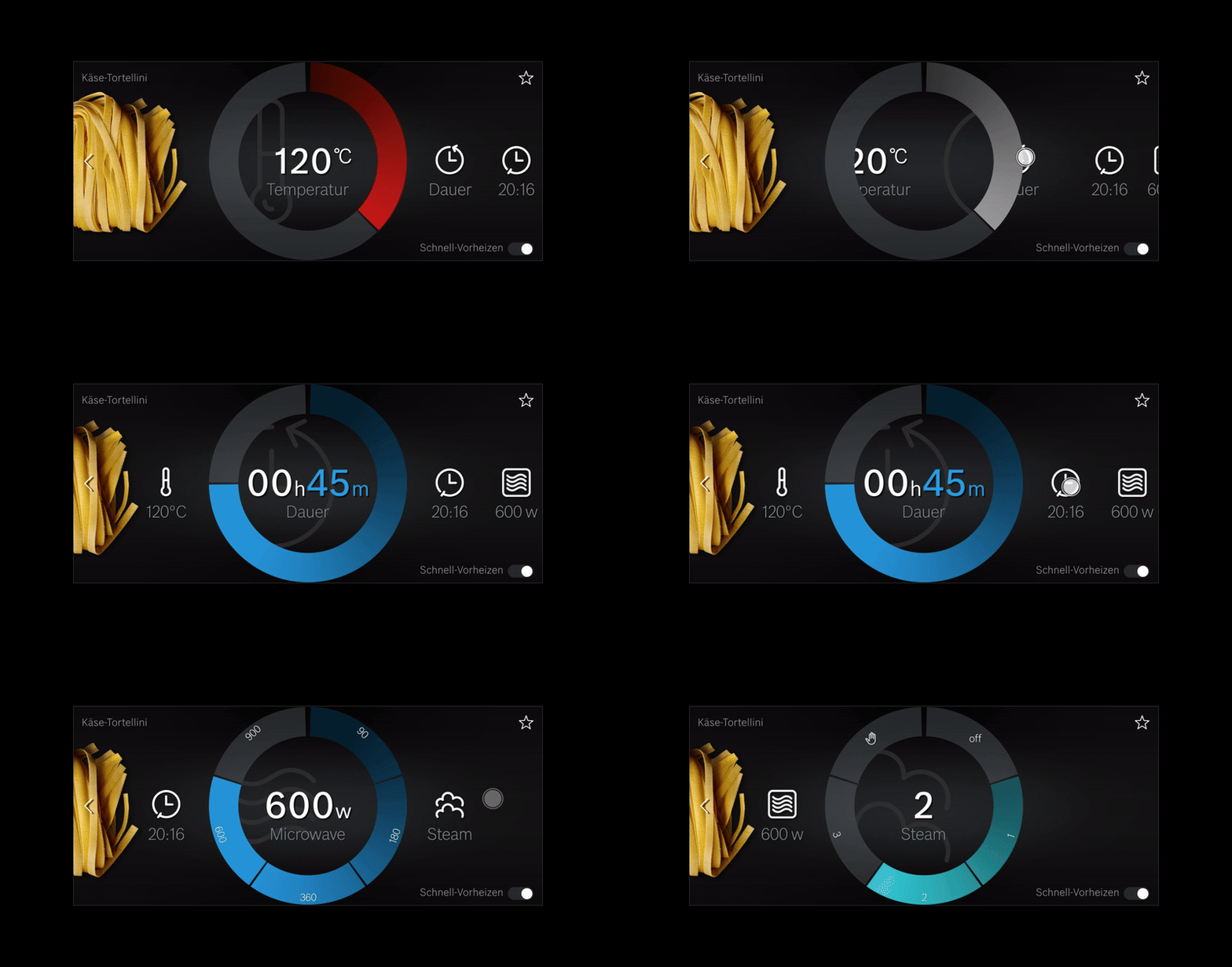
Design exploration to shape and define the next-generation visual language for a German home appliance manufacturer. In close collaboration with the product design and to incorporate the latest technology, the team conducted a broad exploration based on the reference appliances of the oven, washing machine and coffee maker. Using an iterative design approach, we synthesised a visual direction for which we created screen designs and motion snippets. Unfortunately, this project is under a non-disclosure agreement, so I can’t show you more.
As lead visual designer, I hosted the initial strategy and ideation workshop, set the project strategy, worked on the visual design from exploration to the final screen design, guided the motion design and presented the results to the client.
- Emphasize Motion and Transitions
Ensure to spend sufficient time on the exploration of motion and screen transitions to elevate the perception of the product’s quality. - Use Physical Mockups
Integrate a front panel in mockups to better simulate the look, feel, and interaction of the final product, aiding in understanding the visual impact of angled interaction areas. - Plan for Long Development Cycles
In large companies, anticipate that aligning digital and hardware development can take several years from exploration to market readiness.
